English Football with Shiny Pt. 2
Written on January 6th, 2020 by Gerard Kirwin
"Cowie Celebrates" by joncandy is licensed under CC BY-SA 2.0
On the last episode…
I made a simple Shiny app that allowed users to view English football standings tables by year and division.
In this blog, I will add to my app and add a plotly graph.
Data Cleanup and Calculations
For the graph I wanted to make, I needed to calculate each team’s “total position” for each year.
English football operates on a system of relegation and promotion between their multiple divisions which are tiered.
Usually the bottom 2-4 teams in each division are relegated to a lower division and the bottom 2-4 teams in each division are promoted to the next division.
I wanted to calculate where every team is on the system of tiers each year and be able to graph that which would be a good visualization of how teams have progressed through the tiers.
The top team in the top tier is 1 and the bottom team in the bottom tier is the highest number (for example 92 in 2017-18).
To figure out each team’s “total position”, I needed to have a counting sequence through the tiers, and have it start over every year.
In my dataset, the tiers were listed as text such as “First Tier”, which is unreadable for a sequencing function. So, I changed each tier to a number, 1 through 4, which the function could sequence through.
Then I used R’s within function to sequence through the tiers and then through the years. This worked a charm showing me 1 for the top team in the top division in each year and a number in the 80s or 90s (depending on the size of English League football in a particular year) for the worst team in the lowest division.
The code used is shown below:
table_season_tiers <- table_clean %>%
  mutate(Tier=str_replace_all(Tier, "First tier", '1')) %>%
  mutate(Tier=str_replace_all(Tier, "Second tier", '2')) %>%
  mutate(Tier=str_replace_all(Tier, "Third tier", '3')) %>%
  mutate(Tier=str_replace_all(Tier, "Fourth tier", '4')) %>%
  arrange(Season, Tier, Pos) %>%
  within( {
    'Total Position' <- ave(Season, Season, FUN = seq_along)
  })

table_season_tiers <-  table_season_tiers %>%
  mutate(`Total Position` = as.numeric(table_season_tiers$`Total Position`)) <br>
It should be noted that I did these steps when I was doing the cleanup for the data I used in my last blog. So, when I renamed the tiers from “First tier” to 1, later I renamed 1 to First Division or Premier League, as I mentioned last time.
Visualization
I have a notebook on my desk where I draw or write out what I want to do with each project. With this project, I wanted to create a graph that showed how teams progressed through the years with the ability to look at information about each year. While doing some research, I found that using plotly would give me an interactive graph with a hover-over ability with limited coding.
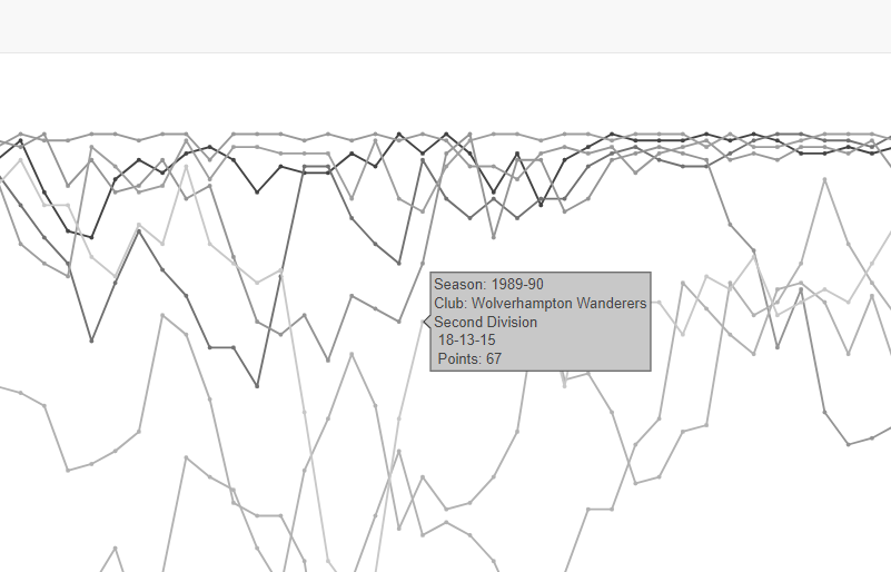
After cleaning up the data, I worked out the plot using ggplot and then using ggplotly to transform it into a plotly graph. I originally wanted to create something akin to a bump graph but with so many teams, the graph quickly got very cluttered. I was inspired by this graph with so many points and lines. So I went with simple geom_point and geom_line layers. Inspired by that New York Times graph, I decided to go with a gray color scheme with the lines. Another consideration for going gray was that my other option, assigning each team’s colors to their line would not only be burdensome but potentially confusing as most teams are blue or red.
I decided to go with a classic theme for a cleaner look. The y-axis was listed in reverse as I wanted team 1 team to be on top and for the x-axis, I listed the XXX6-XXX7 years each decade as the data set started in 1946-47. Passing all these arguments into ggplotly, I made the settings for the plotly graph to display the team’s name, the year, which division they were in, the number of wins, losses and draws and the number of points they earned.

Other settings I specified were removing some of the plotly buttons and having only a few lines show on render. The lines I chose were taken from a calculation I did to find out which teams got the most wins in the dataset and selecting some of the top ones. I also love the functionality of the user being able to select/deselect lines.
Shiny
Moving the graph over to Shiny, I wanted to include my table from the first project. I looked at some Shiny dashboards but decided to go with a simple tabbed page for the simplicity of the look.
I changed a few pieces of code on the table from Part 1, the biggest change being that I used dataTableOutput in this new version, which allows for filtering by column. I also moved the footnote to helpText.
Because of the size of the graph, I went for a 150% width and was pleased to see that it worked and looks good too.
Here is the finished product (Click here to open in a new window):
You can check out my GitHub repository here for the full code.
Next Steps
I really enjoyed this project and I thought it really strengthened my ability to work with large datasets (92 teams times 70 years of data times 15 variables is still pretty large) and my ability to look at data and understand pain points for dealing with it.
I learned quite a bit about plotly as I was able to use some of my JavaScript skills learned from my Leaflet project to understand some of the options.
I’m thinking of doing a third part where I add in another tab where users can interact with some total data, but I decided to leave that out for now.
While housesitting, I got to read part of a book called “Data Story” by Nancy Durate. A good book with lots of good examples, the book is about using data to tell a story. I thought about that a lot in this project. I feel like with the line graph you can see the stories of the teams throughout time. With the table, you can see the story of each year. If the number of points for teams at the top are close together, you can assume it was a very competitive season. If one team has a lot more points than the others, you would think that they were a great, dominant team. It’s this connection to numbers that brought me into sports in the first place and I am excited to have new tools to explore these stories through the numbers.
My main focus next is working on this online course, Data Science for Environmental Modelling and Renewables from the University of Glasgow. With my interest in Data Science, background in earth sciences and current position working with an energy non-profit, it seemed like an obvious fit and I’m excited to work on it.

