Let's Chat
Written on June 25th, 2020 by Gerard Kirwin
Photo by Mustapha Muhammed on Unsplash
In my current position, I don’t get a lot of opportunities at work to show off my data analyst skills at work. I was excited to learn that our work had an R community meeting and leaped at the chance to go when my manager told me about it. I’ve been attending the meetings as my schedule allows for the last year I’ve been at my job.
Recently, we have been meeting remotely and interacting via Slack, which our company adopted right before we started working at home due to COVID-19. Slack has been very useful for our company and keeping operations going while we’re out of office.
So when the leaders of the R community meetings decided to do a data viz challenge, it only seemed natural to take a look at how people in our company were using Slack.
Data
The data was pulled from basic Slack usage information by channel including name, description (in some cases), date created, number of users, number of messages, number of users who have posted messages. It was a pretty simple data set and taking a look at the numbers, I noticed that one column “change in members who posted”, seemed to not correlate with any of the other data and would have unusual values like “-80” for a book club meeting. For context, members can be added to channels but we were advised to try to keep the groups small. In addition, our company only has about 140 employees so I would be surprised if either 80 people stopped posting in the book club channel or 80% of the book club channel posted and then stopped.
The other columns had numbers that made sense, so I decided to work with those. Channels range in size from 146 for a general discussion group to a few groups with 0 members. Channels have different purposes as well, some are for organizational based groupings (web team, marketing, operations), some are for cross-organization teams (strategic planning, emergency response) and some were for projects.
Since some of these groups of people meet weekly or monthly and some work together daily, I figured that the raw numbers of messages and members would just show which were the largest channels. Instead, I wanted to see which channels were the most active, accounting for channel size. So I created two new columns: Active Membership which was a percentage of members in each channel who had posted and Messages per Member which took the number of messages and divided them by the total number of members. For Messages per Member, I divided by total number of members rather than active members because I wanted to measure how active the channels were in relation to all members, not just those posting.
I remembered from staff training that channels were named with prefix based on what type of channel they were. Channels starting with “all” were general channels, like book clubs. Channels starting with “eto” (the acronym for our organization) were organizational based, channels starting “info” were about technologies used at the organization (including R), channels with “proj” were projects and “team” were teams. This allowed me to categorize the channels by type. There were a few channels that did not follow this nomenclature, so I combined them into “other”.
Visualization
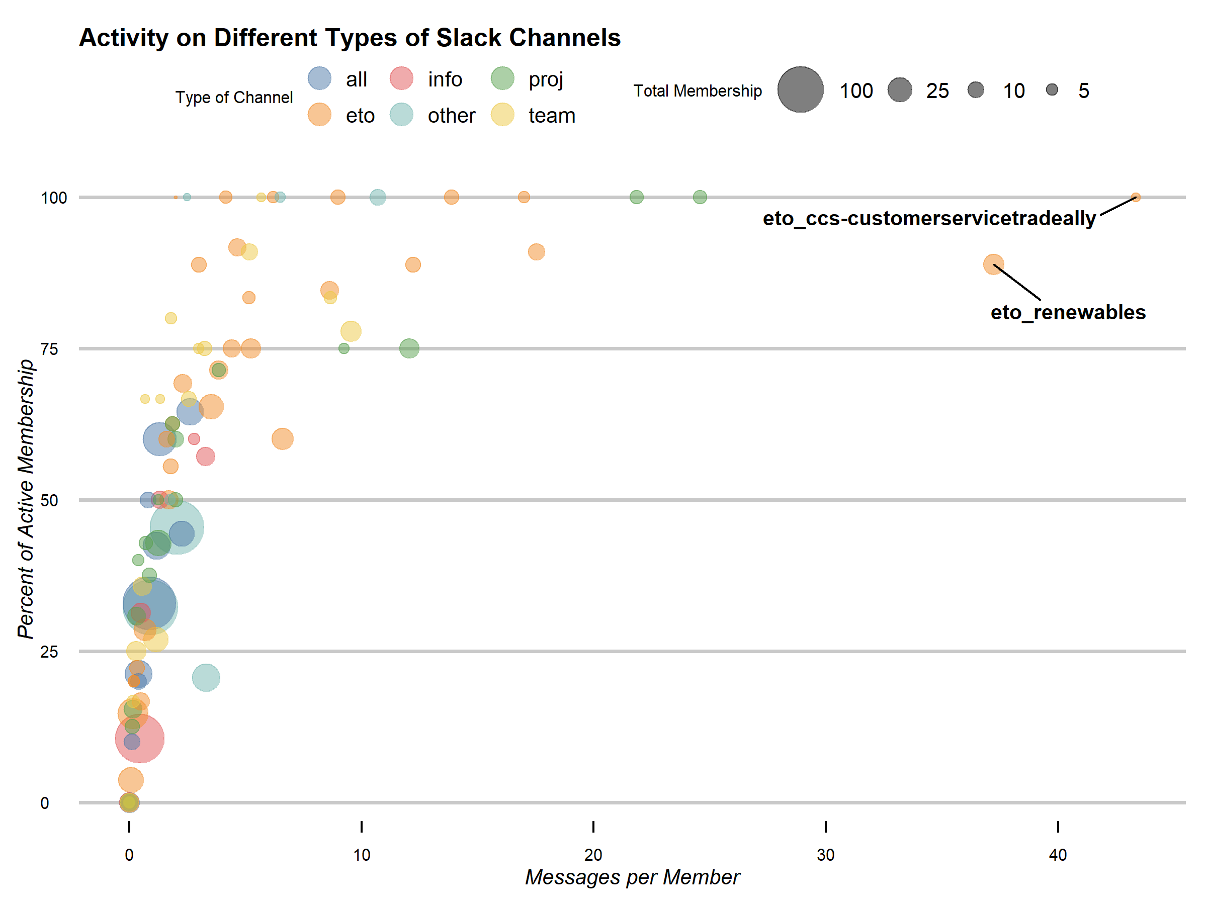
After I decided how I wanted to look at the data, I decided on a bubble chart. While I created the new columns because I didn’t want group size to effect the patterns, they are still an important part of understanding the graph so I made channel size the so-called “third variable” of a bubble chart. I set the types of channels by color, using scale_color_tableau to choose colorblind-friendly colors. With the aesthetics of color and size, I believe the graph shows what type of channels (size and content) have the most activity.
As for the theme of the graph, I wanted something simple but customizable so I could show off my code skills to my coworkers. I chose theme_economist_white which I have used before. Some of the items I customized compared to the default theme were: changing the size and scale of the circles in the legend, changing the font by using the actual font used in The Economist, moving the axes labels and removing the line from the x-axis. Finally I used geom_text_repel to create labels for the two outliers.
Here is the final result:

I put my code up here on GitHub.
Analysis
Slack was new to most of the employees at my company so I came into this exercise with no expectations about what kind of patterns my analysis would show. My company is about even between older employees and newer, and also about even between tech-savvy and not so tech-savvy.
Looking at the graph, the pattern is that as active membership increases, the messages per member increases. A slight correlation and kind of obvious but you can still see the relationship. As for the other variables, “all” channels tended to have less activity but were larger. The “eto”, “team” and “proj” channels were the most active which makes sense as they are more focused and their memberships are based on the existing working relationships in each channel. Finance people would naturally talk to their colleagues more as would members of a project working on the budget or an innovation team.
I highlighted the two outliers, knowing that my coworkers would know what the acronyms meant and at least a vague idea what the channel was. For our purposes, I’ll go into the two in detail and why I was not surprised to see them so far away from the others.
The channel “eto_ccs-customerservicetradeally” had 100% of it’s members post messages and also had 43 messages per member, almost double the third highest in that category. The channel is also one of the smallest with only 3 members. CCS is our organization’s communications and customer service group and this group specifically deals with our “trade allies” who are contractors specially qualified by the organization who work directly with our customers. Providing customer service and answering questions related to that is a common use of Slack at many organizations and this seems to suggest that this team is getting a lot of use out of using Slack to deal with customer service issues. I don’t know enough about that team to know if this has replaced in-person or email interactions on these issues. But the channel is clearly providing a service while employees work from home.
The other outlier is called “eto_renewables” which is related to the Renewable energy program. 88% of it’s members post messages with 37 messages per member. This group is about average size for one of the organizational groups with 18 members. Anecdotally, I know the Renewables team is known for being one of the more vocal groups in the office so it does not surprise me to see them this high. I do wonder if the large messages per member suggest that they do not use the threads feature rather than chattiness.
Next Steps
One of my coworkers “cheated” and downloaded the Enterprise Analystics CSV instead of Channel Analystics that were used in the challenge. He also used an average messages per user metric and graphed a large spike when work from home began but a leveling out around 80 messages per user per week including direct messages.
I feel like we have enough evidence to show that Slack is being used by most employees and is very useful to them. From what I heard, both IT and management are happy with it as well. So I would not say that further investigation would be necessary but it would be interesting to see if usage changes over time.
As for our R group, I won the contest! I don’t think I’ve won anything since Kindergarten. In showing off my code to the group, one of the leaders asked what I learned from this exercise. It took a me a minute but I answered that I learned that when working on a project to focus on the final product. I spent a lot of time trying to clean the data table, specifically renaming the columns and deleting the unused ones. But that was irrelevant as this was a data viz activity so I learned how to better use my time, especially since I was up against a deadline.
As one of my prizes, I got to choose the next data set. I went in a different direction, thinking about the events that have occurred since the death of George Floyd and the resulting movement and focus on systemic racism.
I chose a dataset about the urban heat island effect in Portland, where I live and work, which surprisingly has one of the strongest heat island effects of any US city. This dataset includes demographic data such as percentage of people of color and median income broken up by census block along with “urban heat” temperature data calculated in Celsius on an unusually hot summer day. The data set is a GeoJSON but I also gave advice to my coworkers, a number of whom are newer to R than I am, that they could convert it to a data frame and extract the demographic data from there.
There’s more details in this paper, including sociodemographic data analysis on Air Conditioning and public heat refuges not included in the dataset. I felt like this dataset was a really good one to choose because it was not very large but had a lot of sociodemographic data that I think is important for people in my organization to remember in regards to the impact of environmental racism. I hope they come up with some interesting visualizations!
I may tackle this dataset at a later date but currently I am working through a Python course to strengthen my coding skills in addition to mid-year changes at my day job.

