Back to School
Written on November 25th, 2019 by Gerard Kirwin
"Language Arts Class with Help" by Judy Baxter is licensed under CC BY-NC-SA 2.0
After my last project, I was looking for something simpler to practice my data analysis skills.
Don’t get me wrong, you can cut your teeth on building something like the map from my last post but sometimes you need to get product out quickly.
So, I went looking for some data to play around with where I could produce some simple (but not too simple) visualizations.
Once again, I turned to Tidy Tuesday. This time, in their archives, from September was data about racial diversity in schools. Until June of this year, I had worked in education the last 7 years, so this dataset would allow me to bring in my background knowledge. This perspective would become useful not only in the way I expected, in looking at and manipulating the data; but, also in the way it was visualized.
Data
The School Diversity dataset was relatively clean already from the work done by the Washington Post, who originally collected the data, and the Tidy Tuesday team. Looking at the data was when I formulated what question I wanted my data to answer and what I would need to do to it to get there.
The dataset featured data on all 50 states and Washington DC. It featured data from the 1994-1995 and 2016-2017 school years as comparison. Also, the data included information about whether the district was integrated, meaning how likely is a school to have a similar racial makeup as the whole district.
While looking at the raw data from top to bottom ordered by state, I quickly got to my home state, Arizona. Arizona was one of the fastest growing states in the country during the 90s and the 00s. This fact, and my knowledge of the area, led me to want to investigate only the Arizona data. And I quickly settled on what I wanted to investigate. How has Arizona’s growth had an impact on the racial makeup of its schools?
To make the data ready for this investigation, I filtered the state category for Arizona. Many school districts in Arizona are “elementary” only or “high school” only. In order to get an even comparison for cohorts, I filtered these districts out, leaving only “unified” school districts that serve K-12.
Finally, my last step was to turn the data from a wide format with each row belonging to a school district in a given year to a long format with each row belonging to a racial group at a school district in a given year.
Visualization
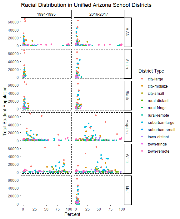
I wanted to start with a simple dot plot to see if there were simple visual patterns could be seen between the two school years. I decided to go with a classic geom_jitter and changed the theme so it was simpler to see the dots which were colored by the school district type. I felt like a white background without gridlines would allow us to see the patterns easiest.

The first thing that I notice in this graph is the shift in the White and Hispanic groups. The orange and blue dots which reflect “city” and “suburban” school districts. The two orange dots, representing large city schools, located near the top of each group have moved from about 25% to 50% for Hispanic students and from 75% to 50% for white students. Not surprising considering the increase in the Hispanic population and the phenomena of White Flight. Looking at the blue dots, you can see there has been a shift there as well but not as much. Moving from 15% to 25% for Hispanic students and from 80% to 60% for white students.
These observations got me thinking about my second visualization. Having grown up in Arizona, it was not uncommon for a large field or patch of desert to turn into a new housing development or shopping center almost overnight. I know there are many school districts that have had massive changes in student populations due to development. I was curious as to how this changed the racial makeup of the school district.
My first thought was to create a stacked bar chart. My thinking was that this would be the easiest way to show changes between the two time periods. To show this in a legible way, I needed to narrow down from my 102 school districts included in the above graphic. I decided to look at schools with the largest percent of total population increases, so I calculated these (in R, of course). The biggest change was a district that grew 6,812%!
I chose six school districts among the top 12 in population increases. I picked the districts instead of picking the highest numeric changes (8 out of 12 were Phoenix suburbs) so it was more representative of different regions of the state. Of six districts I chose; two were in Maricopa County, two were in Pinal County and two were in Southern Arizona. The six represented five different types of school districts (two were labelled “town-distant”).
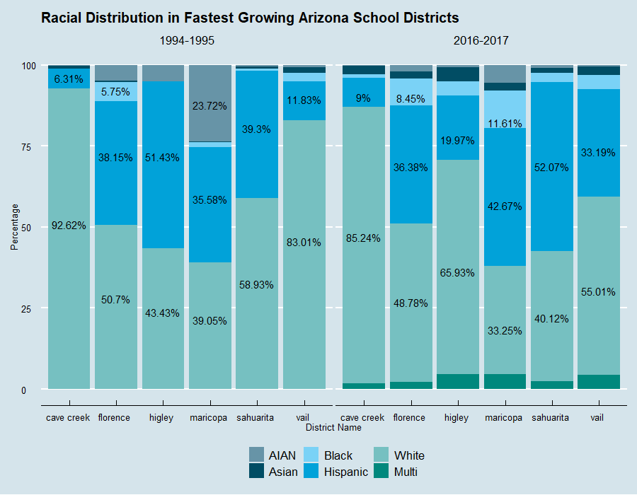
I took the six schools and made a stacked bar chart. Looking around for interesting themes, I saw the Economist theme from ggthemes package and thought that might look good for this project.

Vail and Sahuarita districts, both located around Tucson became more racially diverse. Maricopa and Higley became less diverse with large decreases in AIAN (American Indian and Alaskan Native) students. Higley also experienced a large increase in white students. Cave Creek and Florence stayed roughly the same. There are plenty of discussions and more investigation that can look into the hows and whys but I believe the findings show that outside of the changes in Higley, there doesn’t seem to be large scale changes in communities based on race.
Conclusions and Reflection
While working on this project, I feel like I reached a new level of comfortability with using R for data analysis. I was able to use not only what I had learned online but what I had done in previous projects. This project took only about 5 hours excluding breaks, which was far quicker than my previous project which included that challenging map.
As for conclusions about the data, I feel like I can come up with some answers to the question I posed earlier. Arizona’s growth has had an impact on larger schools more than smaller ones as evidenced by the larger population dots in my first visualization. Growth is largely a change between Hispanic and White students particularly in cities, suburbs and metro-adjacent towns. In the fastest growing districts, there is no evidence of an overarching trend of one racial group changing demographics more than another, outside of the representative demographic changes occurring state-wide. However, there are signs that in certain communities demographic changes, based on suburban development, may be making the districts less diverse.
You can check out my GitHub repository here for the full code.

