On The Way to Work
Written on November 6th, 2019 by Gerard Kirwin
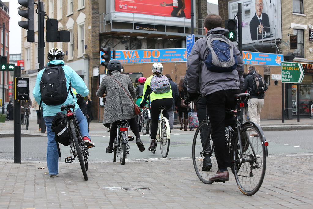
"London bike commuters" by kube414 is licensed under CC BY-NC-ND 2.0
I’ve had a keen interest in maps since I was a child. I’m not sure how it started but for as long as I can remember, I’ve been captivated by weather maps, world maps, the 1992 Rand McNally foldable map of the Southwest in my mom’s minivan. I’ve been searching for a data science project in R to give me an opportunity to learn how to make maps in R.
I minored in Geography (with a focus on GIS) in college 10 years ago but the software is so expensive and didn’t work on my Mac, it made it impossible for me to use and practice. I really enjoyed using it and was really excited when I learned that I could do the same things in R!
My first idea was to create a map of places that I have photographed. My plan was to use Google Maps and my memory to try and find approximate latitudes and longitudes and put them on the map. Since my photographs are film photographs, there is obviously no metadata so I would have to produce it myself. I started working on this but it was so time consuming, and work has been busy lately so I put this project aside and looked for another project where I could develop some mapping skills.
Naturally, one of the first places I looked was #TidyTuesday, the Twitter-based community where a new set of data is released each week and people are asked to share what they come up with. I have been wanting to do some to flex my R skills so I waited for one where I could turn a dataset into a map.
Data
This week’s #TidyTuesday had a data set of biking and walking commutes in the United States. It is a relatively simple dataset. 9 columns and just under 3500 rows representing small, medium and large American cities with both “bike” and “walk”. The data came from the American Community Survey run by the United States Census. The data from the Census broke it down by “city size”. I couldn’t find another database where those categories were broken down, so I decided to use the Tidy Tuesday dataset from GitHub instead.
Data Cleaning and Formatting
My first task (outside of downloading the data and uploading the needed packages) was to clean up the data. The “city” column was messy. It included the city name and the designation of the city, for example, a township or borough. This information is not necessary for my purposes so I got rid of it.
clean_commute <- commute %>% mutate(city=str_replace_all(city, " city", "")) %>%
mutate(city=str_replace_all(city, " town", "")) %>%
mutate(city=str_replace_all(city, " village", "")) %>%
mutate(city=str_replace_all(city, " municipality", "")) %>%
mutate(city=str_replace_all(city, " borough", ""))  %>%
mutate(city=str_replace_all(city, " \\(balance\\)", "")) %>%
mutate(city=str_replace_all(city, " urban county", ""))
Then I created a new column of the city and state combined to allow for the searching of the geographic coordinates. My original plan was to use the ggmap package. However, because the package uses the Google API, it required registering. I don’t know how often I plan to use it so I decided to look around for alternatives.
It was through this I was able to learn about another R mapping package, leaflet. This package uses the OpenStreetMap you are likely familiar from craigslist. This meant I needed to do another step, as ggmap has a built-in coordinate fetcher and leaflet does not.
I found an answer on StackOverflow and I rewrote the code for my purposes which gave me geographic coordinates for all the cities in my dataset. From here, I did a little more tidying with the place names and had to change the coordinates to the correct type.
clean_commute <- clean_commute %>%
mutate(address=str_c(city, state_abb, sep =", "))


geo.dsk <- function(addr){
  require(httr)
  require(rjson)
  url      <- "http://www.datasciencetoolkit.org/maps/api/geocode/json"
  response <- GET(url,query=list(sensor="FALSE",address=addr))
  json <- fromJSON(content(response,type="text"))
  loc  <- json['results'][[1]][[1]]$geometry$location
  return(c(address=addr,long=loc$lng, lat= loc$lat))
}
map_commute <- do.call(rbind,lapply(as.character(clean_commute$address),geo.dsk))
map_commute <- tbl_df(map_commute)
map_commute
tbl_df(clean_commute)
new_map_commute <- map_commute %>%
inner_join(clean_commute) %>%
distinct()

new_map_commute <- new_map_commute %>%  mutate(long = as.numeric(long)) %>%
  mutate(lat=as.numeric(lat)) %>%
  filter(!is.na(address))
Visualization
Then I set to work with plotting my map in leaflet, which was surprisingly easy. The options were pretty straightforward and when I needed some help, I consulted the help function and various sources via Google. I also want to shoutout out Earth Lab, whose work I found extremely helpful while working on this project.
My first idea was to have two seperate maps, one with biking data and one with walking data. Then, I saw that the data, being presnted spatially, would probably make more sense together. Since I’m looking on a map, I would be more invested in how neighboring cities compare rather than the different modes.
Next, I played with some of the leaflet options to create the map. I chose to keep the cluster options on the map because I thought it was the most elegant way to zoom into sites. For example, if I wanted to see Portland Oregon, I would click on the circle in the northwest. I also made the popup display the city name and percent of commuters who use each mode.
The biggest struggle I had was with the markers themselves. My initial thought was to have a marker with respective bike and walk icons. For some reason, I was not able to get the icons on the walking markers. I tried a number of different methods but nothing seemed to work. For the sake of getting this project out in a timely fashion, I changed the markers to be color based and added a legend.
Here is the finished product:
You can check out my GitHub repository here for the full code.
Conclusions and Next Steps
This project is different than some of my others because I did not do much data analysis. I’m sure if you search #TidyTuesday on Twitter this week, you’ll find lots of excellent examples of people who have done some analysis. A quick look shows me that the largest percentage of people who cycle to work live in the Northwest, for example.
My project is more about presenting the data in an accessible format. I keep thinking about how I can expand this project. I think of trying to resolve my issue with using icons and then eliminating the legend. What if I added other types of commutes such as driving and public transportation? What if the color was based on percentage of commuters using each mode? I have lots of potential additions I can think about adding, which is pretty amazing from a dataset with only 9 columns.
I also look forward to contributing more to #TidyTuesday in the future. If you’re reading this and have any comments or questions, feel free to shoot me an email or find me on Twitter.

