Ladies, Get In Formation!
Written on September 28th, 2019 by Gerard Kirwin
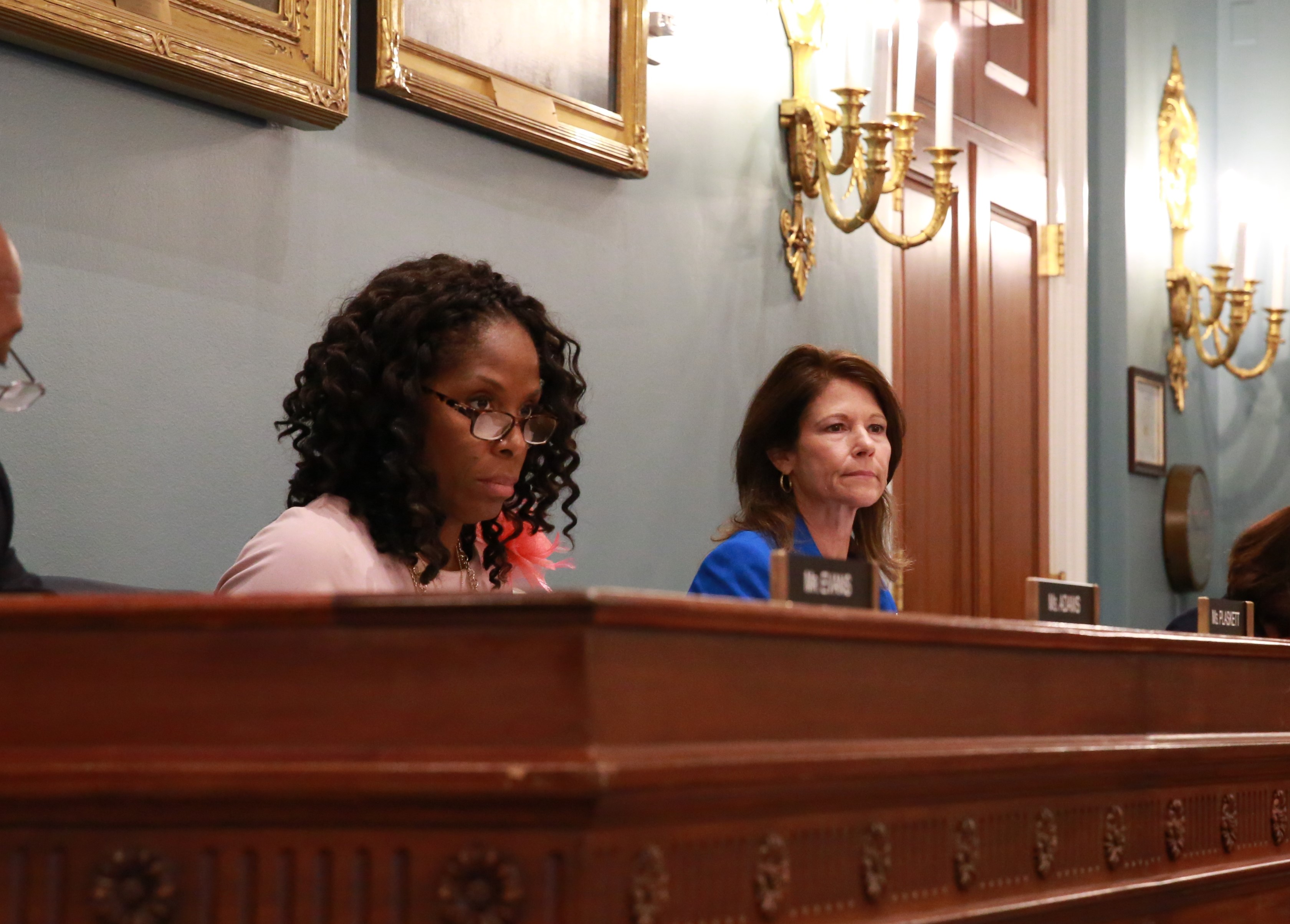
"Congresswomen Stacey Plaskett and Cheri Bustos" by HouseAgDems is licensed under CC BY-NC-ND 2.0
Teaching myself R has been fairly easy. I’ve been working on Data Camp’s Data Analyst Track for a few months now, and I’ve made my way through their guided exercises. The next step in my data science learning journey is to work on some projects on my own. As much as I have learned from the exercises, nothing is better than doing it yourself. My blog will follow these projects.
Data
I stumbled upon the Women In Parliament data set on Twitter and was interested in doing a project that isn’t a boilerplate “car mpg” or “iris” seen in many R courses. I was also drawn to the project for its real world implications and possibilities for social and political impacts. Not something you can get from the sepal length of an iris.
Analysis
I went through the instructions included with the Tweet, cleaned the data, and produced graphs. I decided to redo the project using the United States instead of Portugal.
I have also added two more items to clean up the dataset. First, since I am focusing on the United States, it would be useful to compare it to other North American countries. Unfortunately, the data set puts North and South American countries together as “The Americas.” I put together the following code to create a “North America” and “South America” region for better analysis. It’s a pretty simple mutate call, but I listed it here so you can see how the countries were divided.
WPN <- WP2 %>%
    mutate(Continent=replace(Continent,
                     Country %in% c("Antigua and Barbuda", "Bahamas, The", "Barbados", "Belize", "Canada", "Caribbean small states", "Costa Rica", "Cuba", "Dominica", "Dominican Republic", "El Salvador", "Grenada", "Guatemala", "Honduras",   "Haiti", "Jamaica", "Mexico", "Nicaragua", "Panama", "Puerto Rico", "St. Kitts and Nevis", "St. Lucia", "St. Vincent and the Grenadines", "Trinidad and Tobago", "United States"),
                     "North America"))

WPN <- WPN %>%
    mutate(Continent=replace(Continent,
                     Country %in% c("Argentina", "Bolivia", "Brazil", "Chile", "Colombia", "Ecuador", "Guyana",  "Paraguay", "Peru", "Suriname", "Uruguay", "Venezuela, RB"),
                     "South America"))
The second issue I had with the dataset was the odd values in 1990. Every plot from the exercise made 1990 seem like an outlier—it skewed each graph in a way that didn’t seem correct. From the example in the documentation with European countries, the percent of women in the Romanian parliament took a sharp drop after 1990. Knowing this was right after the fall of Communism, I wondered if the spirit of revolution had produced progress on gender equity, only for it to recede in the years following.
A little investigation finds the data to be incorrect. The dataset shows Romania with 34.4% women in their 1990 Parliament while my research found that it was only 3.62% (14 out of 387) in the lower chamber and 0.84% (1 out of 119) in the upper chamber. While Romania is just one example, there is clearly something wrong with the data.
From the documentation, the 1990 data is from the World Bank directly while the 1997 and later data is from the Inter-Parliamentary Union (IPU). In addition, the World Bank data included upper chambers while the IPU data only includes lower chambers. I’m not sure that either of these are the cause of the enormous error we saw in the Romanian example, but I know the inconsistent and unreliable data needs to be removed.
Visualizations
With the 1990 data removed and The Americas separated into North and South, I am ready to do some visualizing and analysis. The North American dataset includes 24 countries and produces a messy graph; click if you dare. From this point forward, I will use the ten largest countries in North America.
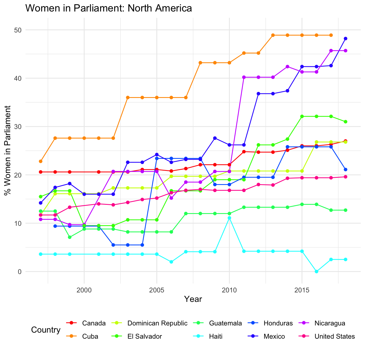
Here’s a basic line graph with our data:

I used a portion of the code from the documentation, moved the legend to the bottom, added the title, changed to the minimal theme, and chose a rainbow color scale. All of these changes were meant to make the graph easier to read. With this simplified graph, you can see that the United States (in pink) lags behind Cuba, Mexico, Nicaragua, El Salvador, Canada, Dominican Republic, and Honduras in women’s representation in 2018’s national legislatures. This graph shows us patterns (such as an increase in most countries after 2010) and individual changes (often due to political changes within each country).
I tried a number of other interesting approaches to try and visualize this data another way, including a violin graph. The best representation I could find was a ridgeline plot.
library(ggridges)
library(viridis)
WPN %>%
filter(Country %in% c("United States", "Mexico", "Canada",
                    "Haiti", "Guatemala", "Cuba", "Dominican Republic", "Honduras", "El Salvador", "Nicaragua"))  %>%
ggplot(aes(y=Country, x=pctWiP, fill=..x..))+
geom_density_ridges_gradient() +
scale_x_continuous(expand = c(0.01, 0)) +
scale_y_discrete(limits=c("Haiti", "Guatemala", "United States", "Honduras", "Dominican Republic", "Canada", "El Salvador", "Nicaragua", "Mexico", "Cuba")) +
scale_fill_viridis() +
xlab("% Women in Parliament") +
ggtitle("Women in Parliament: North America (Since 1997)") +
theme(legend.position = "none", plot.title = element_text(hjust=0.5))

I filtered and arranged the countries using dplyr by the highest percent in 2018 and copied the output. I know it would have been cleaner to have this output transferred in the plot using reference code, but I was unable to get it working on my console.
The ridge shows the deviation in the time period of the data and the color is related to the percent. This means the shape of each line shows us how much change there has been in the last 20 years. Bell-like curves have changed little where curves that look like rolling hills have changed quite a bit. The graph shows little change in most countries, including in the United States. The graph has the added side effect of showing each country clearer than the line graph did.
Conclusions
This data includes office holders through December 31, 2018. In 2019, the percentage of women in the United States lower chamber (the House of Representatives) has increased to 23.6%from 19.8% in 2018. No surprise here—the election of several new women in the House was a major story in the 2018 midterm election. The next House election is in November 2020, but since Representatives take office after December 31st, their impact will not be seen in this compiled data until 2022.
Cuba (2nd, 53.2%) and Mexico (5th, 48.2%) continue to hold places in the top 10 worldwide percentages. With recent elections in other countries, Costa Rica and Nicaragua were knocked out of the top 10, but continue to hold steady around 45%. Panama had an election in 2019 where women representation increased from 18.3% to 21.1% Guatemala also had an election this year and their percent increased from 12.7% to 19.4%. Haiti and Dominica are both holding elections in 2019 as well.
With politics being such a volatile field, it’s hard to predict where these numbers will go from here. There is a clear upward trend, but in any given country, an election can change representation depending on the members within the winning parties. Progress is clearly being made across the board, and this hopefully can lead to better representation for other minority and underrepresented groups as well. I believe that increased representation can only help as we confront the issues of the future such as climate change and technological advancement.
You can check out my code for the project on GitHub here.

